

Tote bagS illustrated ✒︎✑
ANPI Vicenza + Piccola biblioteca marsicana
Two screenprinting projects like drawn tales, in videos and details
Cronaca visiva di due progetti serigrafici paralleli e contemporanei

Nel corso degli anni oltre a sviluppare grafiche e stampe in rilievo ho avuto anche l’occasione di ideare illustrazioni per specifici eventi o immaginari da rappresentare con altre tecniche di impressione. Ho collaborato con numerose realtà, centri studi, luoghi di ricerca, cercando di utilizzare le tecniche di stampa non come scelte a priori, ma mezzi espressivi per trasmettere nel modo più genuino e affine il messaggio rispetto alla tematica trattata e al progetto sviluppato.
Over the years, in addition to developing graphics and relief prints, I have also had the opportunity to create illustrations for specific events or images to be represented with other impression techniques. I have collaborated with numerous entities, study centres, research places, trying to use printing techniques not as a priori choices, but as expressive means to convey the message in the most genuine and similar way with respect to the topic covered and the project developed.


Tra queste possibilità espressive ho sondato in più occasioni la tecnica della serigrafia, dagli studi durante la frequenza all’Accademia di Belle Arti di Venezia prima e Urbino poi, fino alle creazioni più recenti. Ho avuto occasione di declinare questo metodo antichissimo in edizioni stampate in tiratura limitata, grafiche libere su carta, ma anche su supporti tessili come shopper e magliette illustrate.
Among these expressive possibilities I have explored the silk-screen technique on several occasions, from my studies while attending the Accademia di Belle Arti di Venezia first and then Urbino, up to my most recent creations. I had the opportunity to translate this ancient method into limited edition printed editions, free graphics on paper, but also on textile supports such as shopping bags and illustrated t-shirts.


Tra le varie collaborazioni, alcune raccontate in altri post precedenti su Behance e tramite i canali social, ho scelto per affinità le grafiche realizzate per la Piccola biblioteca marsicana e per la comunicazione dell’ANPI Vicenza. In queste occasioni ho curato il disegno, la scelta dei colori e dei supporti tessili senza occuparmi in prima persona della selezione degli inchiostri, delle fasi di stampa e confezionamento, se non marginalmente con una supervisione delle varie fasi nell’iter realizzativo.
Among the various collaborations, some described in other previous posts on Behance and through social channels, I chose by affinity the graphics created for the Piccola Biblioteca Marsicana and for the communication of the ANPI Vicenza. On these occasions I took care of the design, the choice of colours and textile supports without personally dealing with the selection of inks, the printing and packaging phases, except marginally with supervision of the various phases in the production process.


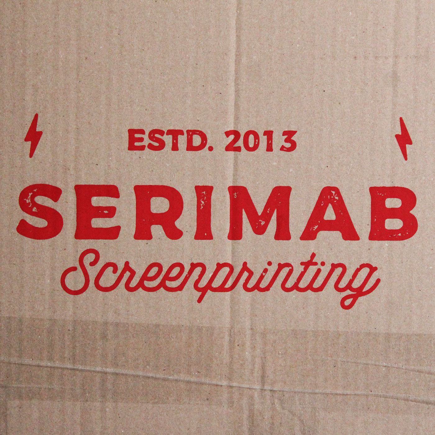
La grafica realizzata e presentata all’interno del progetto da Federico Blu di Prussia è stata serigrafata da Serimab Vicenza su carta, t-shirt e shopper in due versioni cromatiche per omaggiare l’impegno di tanti giovani e rinnovare la difesa dei diritti. Grazie a Pietro Cestonaro che ha curato la scelta dei materiali, la tecnica di stampa insieme a tutti i ragazzi della sezione giovanile Btg. Amelia che hanno contribuito alla distribuzione delle copie disponibili e prenotabili nella sezione cittadina.
The graphics created and presented within the project by Federico Blu di Prussia were screen-printed by Serimab Vicenza on paper, t-shirts and shoppers in two colour versions to pay homage to the commitment of many young people and renew the defense of rights. Thanks to Pietro Cestonaro who oversaw the choice of materials and the printing technique together with all the guys from the Btg. Amelia youth section who contributed to the distribution of the copies available and bookable in the city section.
Per l’80° anniversario dalla caduta del fascismo in Italia, in occasione della pastasciutta antifascista del 25 luglio, ho realizzato un’illustrazione dedicata a Vicenza e al suo impegno per la lotta di Liberazione. Grazie alle indicazioni e i preziosi consigli di Martina Corbetti sono stati inseriti tanti riferimenti legati alla città medaglia d’oro per la Resistenza.
For the 80th anniversary of the fall of fascism in Italy, on the occasion of the anti-fascist pasta festival on 25 July, I created an illustration dedicated to Vicenza and its commitment to the struggle for Liberation. Thanks to the indications and precious advice of Martina Corbetti, many references linked to the gold medal city for the Resistance have been included.


Da Dino Carta all’impegno delle partigiane, dalla tradizione della pastasciutta di papà Cervi fino al classico papavero rivisitato. Quest’anno ANPI Vicenza ha organizzato l’evento estivo grazie alla collaborazione con Porto Burci per festeggiare nuovamente insieme. Accanto ai principali protagonisti sono stati presentati alcuni oggetti e simboli chiave come gli scarponi, le razioni alimentari e le granate per offrire un’immagine unitaria.
From Dino Carta to the commitment of the partisans, from the tradition of papa Cervi's pasta to the classic poppy revisited. This year ANPI Vicenza organized the summer event thanks to the collaboration with Porto Burci to celebrate together again. Alongside the main protagonists, some key objects and symbols were presented such as boots, food rations and grenades to offer a unified image.


È stato scelto di non sottolineare solo la narrazione ricorrente, ma di mettere in evidenzia il fondamentale contributo delle minoranze e il ruolo femminile delle staffette partigiane alla lotta culturale e al contrasto del nazifascismo. Anche in questa accezione la doppia colorazione vuole omaggiare le sfumature plurime che la stagione storica ha portato alla partecipazione politica e all’attivismo conducendola alla stesura della Costituzione Italiana.
It was chosen not only to underline the recurring narrative, but to highlight the fundamental contribution of minorities and the female role of the partisan relays in the cultural struggle and in the fight against Nazi-fascism. Even in this sense, the double colour wants to pay homage to the multiple nuances that the historical season has brought to political participation and activism, leading to the drafting of the Italian Constitution.


A distanza di tre mesi dal 25 aprile, dopo l’evento “Topografie di Resistenza” ospitato da Porto Burci con un’esposizione di poster tipografici in occasione della Festa della Liberazione, l’ANPI torna protagonista. La pastasciutta antifascista del 25 luglio è stata l’occasione per vestire letteralmente le grafiche serigrafate su shopper e t-shirt per trasformare le illustrazioni rosse e nere in vere e proprie immagini della serata.
Three months after April 25th, following the "Topografie di Resistenza" event hosted by Porto Burci with an exhibition of typographical posters on the occasion of Festa della Liberazione, the ANPI is once again the protagonist. The anti-fascist pasta dish on July 25th was the opportunity to literally dress up the screen-printed graphics on shoppers and t-shirts to transform the red and black illustrations into real images of the evening.


Ogni fase di entrambi i progetti sono stati documentati nei singoli passaggi. I video e le immagini realizzate anche da Serimab Vicenza sono state necessarie per registrare e raccontare le fasi di ideazione, realizzazione e di presentazione del risultato finale. Il progetto nella sua interezza è stato veicolato anche attraverso i canali di People of Print e all’interno della comunità virtuale con un articolo dedicato sul sito di Federico Blu di Prussia.
Each phase of both projects were documented in individual steps. The videos and images also created by Serimab Vicenza were necessary to record and describe the phases of conception, creation and presentation of the final result. The project in its entirety was also conveyed through the People of Print channels and within the virtual community with a dedicated article on the Federico Blu di Prussia website.
Una creazione immaginata, disegnata e attesa di vedere trasposta su un nuovo medium! La shopper realizzata per Piccola biblioteca marsicana grazie alla pazienza e disponibilità di Laboratorio Gentile è giunta come una preziosa costellazione di elementi emblematici della terra d’Abruzzo. Personaggi, oggetti iconici e riferimenti della Marsica popolano un tessuto chiaro costituendo un intreccio di storie, legando un’eredità antica a un'eco che risuona nella pratica quotidiana.
A creation imagined, designed and waiting to be transposed onto a new medium! The shopper created for Piccola biblioteca marsicana thanks to the patience and availability of Laboratorio Gentile arrived as a precious constellation of emblematic elements of the land of Abruzzo. Characters, iconic objects and references from Marsica populate a clear fabric, constituting a mix of stories, linking an ancient legacy to an echo that resonates in daily practice.


La tote bag è disponibile sul sito piccolabibliotecamarsicana.it nella sezione “Sostieni” associandosi al Laboratorio Artigiano “Ennio Gentile” ed entrando a far parte del progetto che mira a salvaguardare e rendere vivo un patrimonio culturale unico. Si può scoprire questa collezione digitale sempre più attrattiva per studiosi e appassionati online, oppure partecipando alle iniziative a supporto della cultura abruzzese e della propria eredità culturale.
The tote bag is available on the piccolabibliotecamarsicana.it website in the "Sostieni" section by joining the Laboratorio Artigiano “Ennio Gentile” and becoming part of the project which aims to safeguard and bring alive a unique cultural heritage. You can discover this increasingly attractive digital collection for scholars and enthusiasts online, or by participating in initiatives to support Abruzzo culture and its own cultural heritage.

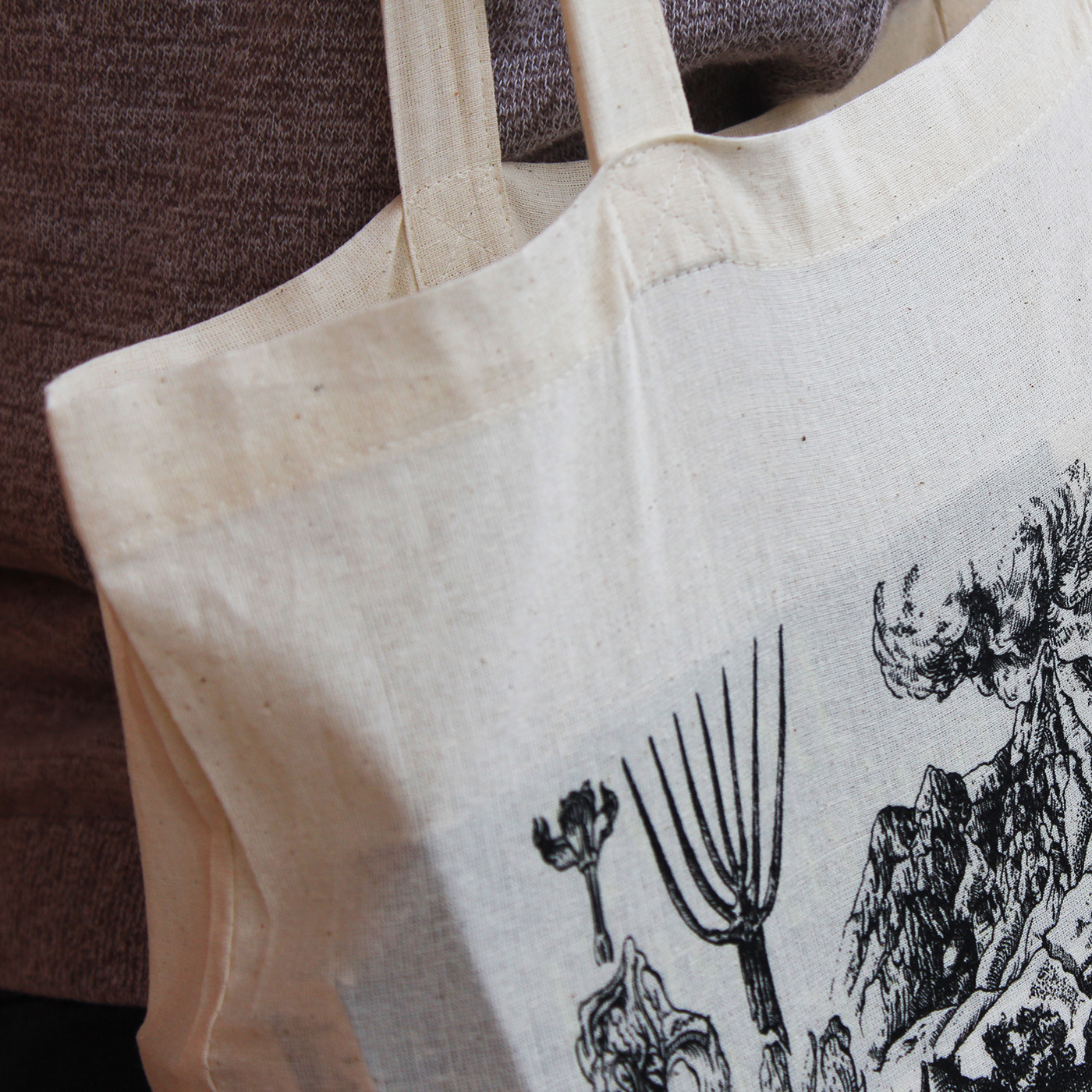
Lo scorcio di un nuovo progetto eretto segno dopo segno alternando i tracciati nelle sere d’estate. Figurazioni botaniche emergono dal biancore del foglio con tratti che si distendono sulla carta, raggiungendo territori lontani. Elementi simbolici racchiudono una terra densa di evocazioni e portatori di un’eredità storica dal ricco corredo iconografico. Il pieno e il vuoto compongono un’illustrazione ciclica che accoglie piante, animali e uomini narrati attraverso le proprie estensioni strumentali, gli oggetti di tutti i giorni, i materiali che resistono all’impermanenza della vita. Tratti che insieme a poche selezionate parole restituiscono una storia tutta da scoprire.
The glimpse of a new project erected sign after sign, alternating the routes on summer evenings. Botanical figurations emerge from the whiteness of the sheet with strokes that stretch across the paper, reaching distant territories. Symbolic elements enclose a land full of evocations and bearers of a historical legacy with a rich iconographic background. Fullness and emptiness compose a cyclical illustration that welcomes plants, animals and men narrated through their instrumental extensions, everyday objects, materials that resist the impermanence of life. Traits which together with a few selected words convey a story waiting to be discovered.


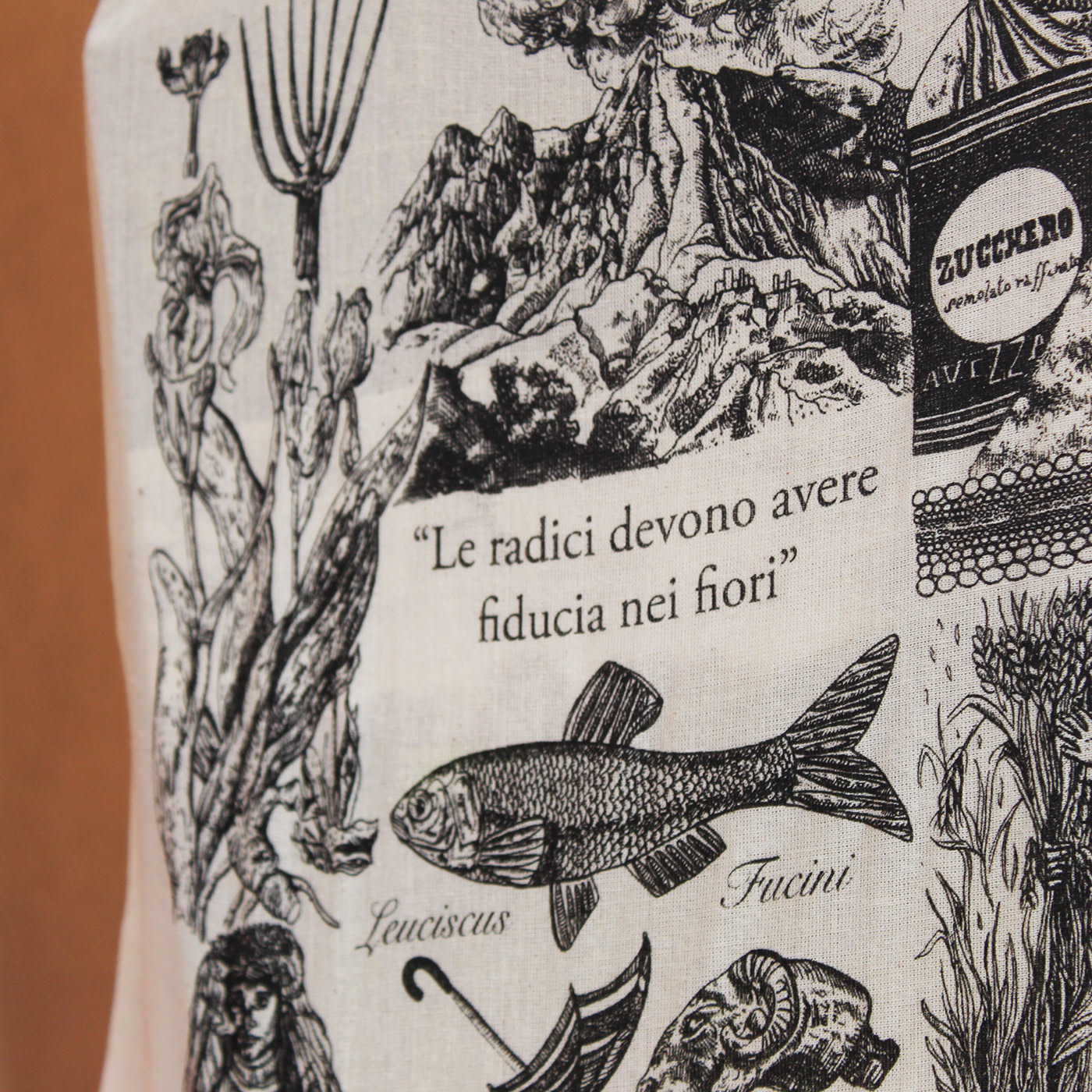
Le shopper illustrate sono nate dalla collaborazione con Alessio. Ideatore e promotore delle attività della Piccola biblioteca marsicana, amico di penna e di una fitta corrispondenza per restituire molte immagini ed elementi caratteristici di una terra densa di scrittori, narrazioni visive, elementi geografici incastonati tra cielo e montagne.
The illustrated shoppers were born from the collaboration with Alessio. Creator and promoter of the activities of the Piccola biblioteca marsicana, pen pal and a close correspondence to return many images and characteristic elements of a land full of writers, visual narratives, geographical elements set between sky and mountains.

Per entrambi le figurazioni la scelta dello stile grafico ha riflettuto una suddivisione del quadrato dell’immagine in nove riquadri dinamici per accogliere un mosaico di elementi caratteristici. I soggetti chiave non sono presentati in una composizione incarnata da una scena unica, piuttosto dalla presentazione di una molteplicità di oggetti, personaggi e scenari che si fanno sintesi visiva dei loghi e delle frasi citate per moltiplicare la forza della loro storia.
For both figurations, the choice of graphic style reflected a subdivision of the image square into nine dynamic boxes to accommodate a mosaic of characteristic elements. The key subjects are not presented in a composition embodied by a single scene, rather by the presentation of a multiplicity of objects, characters and scenarios that become a visual synthesis of the logos and phrases cited to multiply the strength of their story.


